Story by John Cantor / Contributing Writer
Photos by Ethan Pickering / Contributing Writer and Photographer
Many people don’t stop to think about whether they have lost the art of being “in touch” with the world around us.
There are moments of engagement in a subject, but there is often an overwhelming abundance of content swirling around people’s heads, each thought and tribulation screaming for undiverted attention.
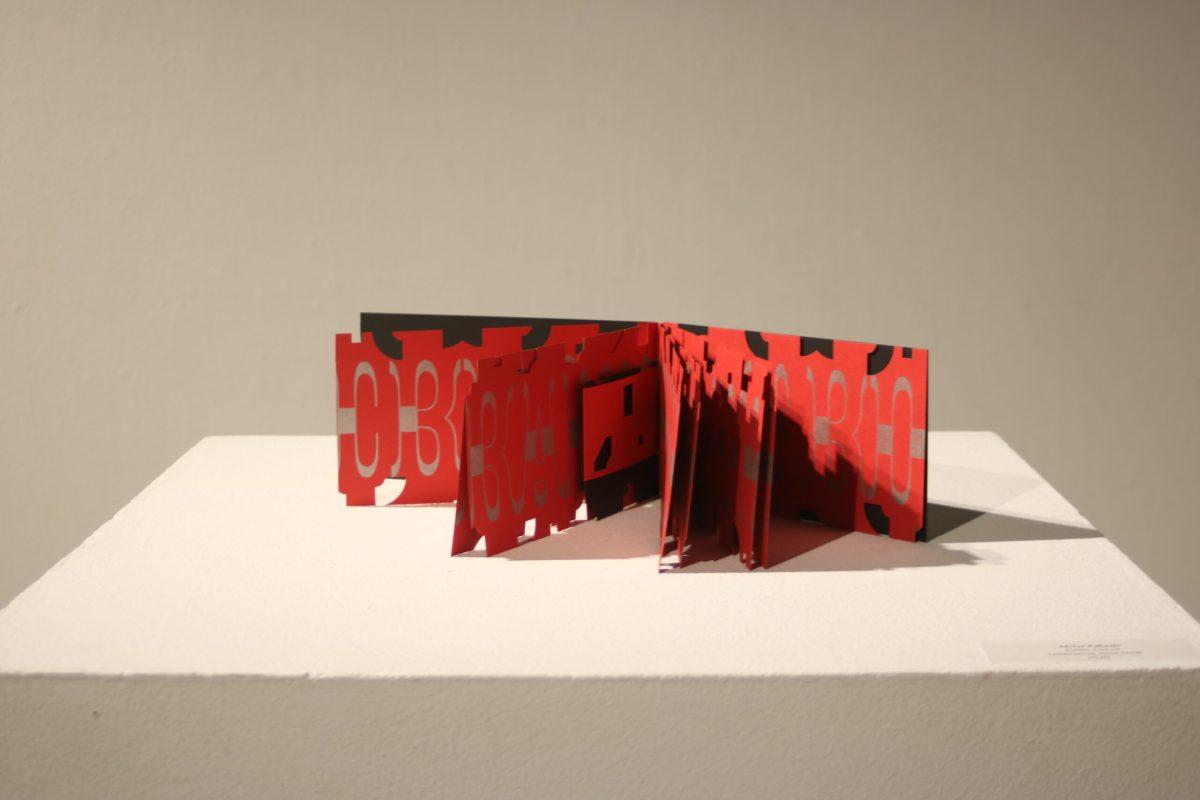
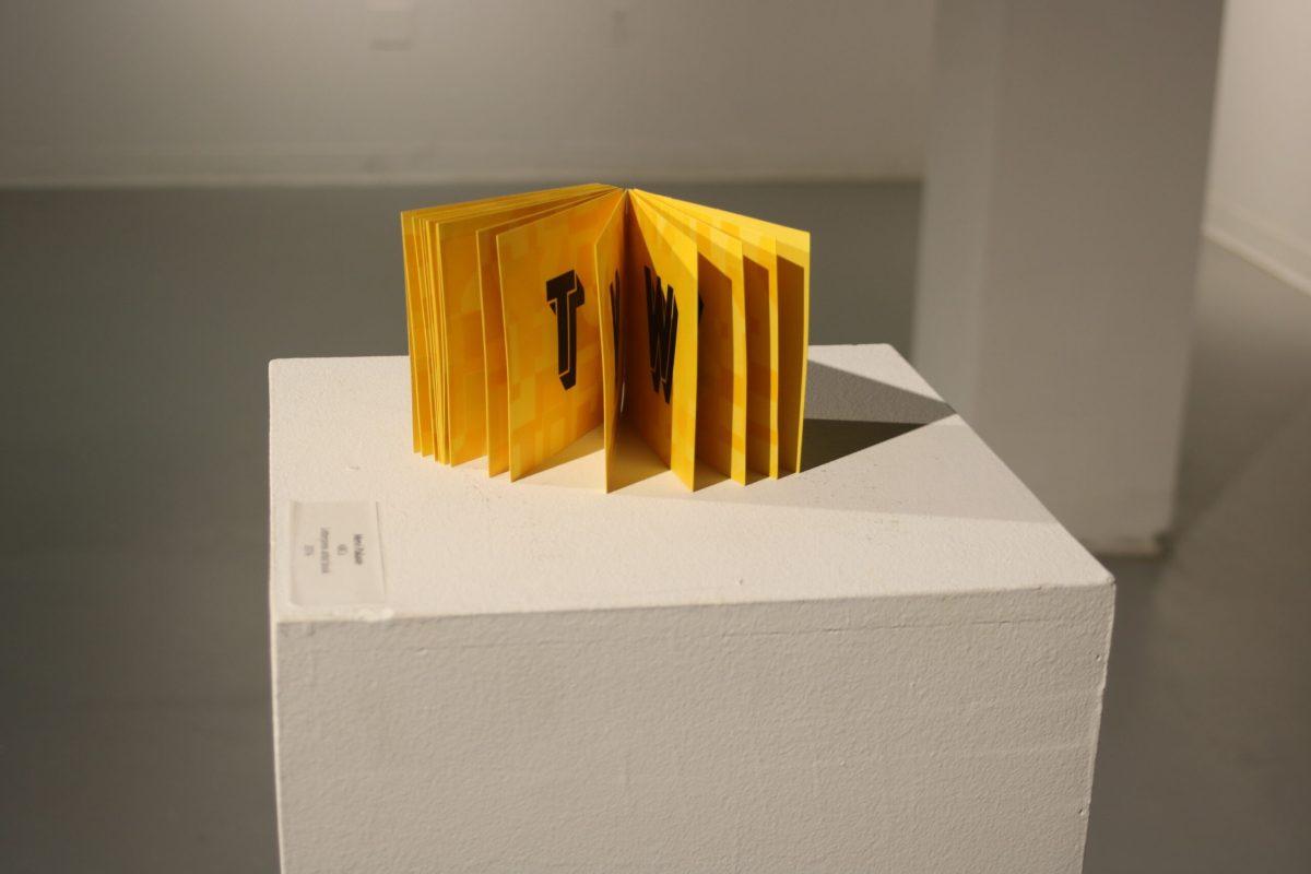
But at the Todd Art Gallery on Middle Tennessee State University’s campus, a current exhibition entitled “Typographic Visions” reminds us to take in what’s happening in our lives. It features beautiful layers of emotion and visual storytelling.
In the age of digital communication– especially during a pandemic, when a majority of people’s social interactions are nearly all reduced to an online presence– there can be very little tactile involvement in our lives. Except, perhaps, for the taps and clicks of laptops or the ghosts of fingerprints smeared across screens.
For Virginia Green, an Associate Professor of Art Graphic Design at Baylor University, and Mervi Pakaste, an Associate Professor of Graphic Design at Kansas State University, a drive for expression through visual concepts has inspired a series of letterpress and book arts.
“During this time of an onslaught of screens, we wish to offer people an opportunity for quiet exploration and discovery of typography and its possibilities for expression.”
Virginia green
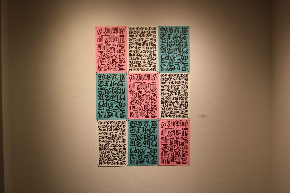
“Typography is one of the main components of visual communication, carrying within it a long history and tradition… The physicality that is involved with setting type, operating a press, or binding a book, creates a bond between the work and the maker, which is then in turn passed on to the viewer,” the artists continued.
On Saturday, Jan. 30, Both participated in an online artists’ talk about their experiences in typography, followed by a workshop focused on the design of folded book structures.
Pakaste, now an American citizen, is originally from the south of Finland. Earning her Bachelor and Master of Fine Arts from Edinboro University of Pennsylvania and Penn State University, it wouldn’t be until she was hired by Wichita State University in Kansas that she’d discover her passion for letterpress.
“They had a letterpress lab at Wichita, this small room…that sparked my interest and right as I was leaving Wichita to Kansas State I managed to get a grant to go to Hatch Show Print in Tennessee,” said Pakaste.
Pakaste showed an image of the historical Hatch Show Print shop, located in Nashville: it was a huge brightly lit room with gigantic looming bookshelves filled to the brim with wooden blocks and letters used for printing posters.
There were long ladders extending up to the ceiling, similar to an old creaky library. Instead of seas of dust covering books, there were the tools to handcraft engaging print designs.
Pakaste accompanied this image with an example of some of the posters created in this shop. A rainbow of concert posters plastered the walls: from a sunset orange “An Evening With Willie Nelson,” at the Nokia Theatre in Dallas Texas written in bold black letters, resembling a “Wanted” poster from the Wild West, to a poster with a leaf-green lion sitting beneath red and green lettering “Bruno Mars Moonshine Jungle Tour.”
Working with print in 2009 at the Hamilton Woodtype Museum in Two Rivers, Wisconsin, Pakaste began a series of pieces where she would take a headline from magazines such as “Life & Style,” and turn them into satirical and sardonic prints mimicking an old-timey newspaper.
In this style, only the headline was featured, focusing on the ridiculous nature of the story. Mocking one cover, a grey and black print Pakaste created read “Hollywood Times,” the words separated with little black stars. “Tom Cruise puts Katie Holmes on an extreme detox.” The base of the poster read in large capitalized print “FORCED TO DIET!”
“I kind of got into this… to me always a kind of weird American superficial thing that’s going on in the popular culture here,” said Pakaste
“These magazines…that have these beliefs, sensational headlines: ‘who’s done that and who’s dating who.’ I’m sitting there, thinking it’s kind of ridiculous… why do we put ourselves through this kind of stuff, especially as women.”
Virginia Pakaste
Pakaste began translating these magazine covers to an older style of poster after thinking of the absurdity of these current headlines and how older styles of media used to look.
Other uses of Pakaste’s print and art skills would often have an important social message, ranging from domestic violence with children to sustainability. She has also created works based around language.
“English is not my first language, clearly. I make a lot of weird grammatical mistakes especially, so I started looking at urban dictionaries, because there are these social things that I always found kind of weird and funny, especially slang,” said Pakaste.
“Being a foreigner, I had to deal with a lot of not understanding what people are trying to say and if I thought I understood what people were saying, I found out that I didn’t because they were using their words in a different meaning,” said Pakaste.
Aside from the messages of each piece Pakaste expressed why using letterpress as opposed to computer design is so appealing.
“I work in graphic design…I work on a computer a lot. It’s very precise…You get a little too focused on everything having to be perfect,” said Pakaste.
“For me, letterpress is one of those things I can’t always control. You are working with old type, some of it is worn. It’s not going to be perfect…that alone is nice for me, just learning to let go and just enjoy and see what you’re doing and kind of learning to accept that not everything is always going to be perfect.”
Mervi Pakaste
Pakaste finished her portion of the artist talk discussing how the way the art is presented can have a powerful effect on the overall message. One example was a piece that featured a dried wood design shaded in with water droplet drawings and a message that read: “1.1 billion people still do not have access to safe water.” The dried and desolate texture of the print highlighted the extremity of the water crisis and water insecurity that many people in the world face.
“I think there’s a conceptual connection there…I think the media affects the message, and so you can use the materials…to enhance the concept and enhance the message that you’re trying to bring out,” said Pakaste.
Green then took over with her own presentation on her work and how she got into the world of print.
“I just love to get off the computer, similar to Mervi, and get inky if you will,” said Green.
“My story kind of began actually in industrial arts class in seventh grade where I printed on…platinum presses,” Green continued.
“I still have my notepads and my little linoleum cut that we made. We were the wildcats in that grade,” said Green.
Her story continues after high school moving from Pennsylvania to Nebraska, trying to figure out what she wanted in her life. Eventually ending up in Texas in 1990 where she’d later earn her BFA and MFA at The University of Texas at Arlington and University of North Texas.
Green began attending auctions in Texas where she’d come across old presses.
“I was bidding against scrappers because they just wanted to melt these down and I bought them and brought them home to restore them and that started bringing the love back of letterpress and my memories of printing,” said Green.
After attending a workshop Green came up with a print of an orange rabbit leaping over beautiful swirls of dark green and a yellow and pink flower. This design would become the logo of her business, “Black Hare Studio.”
“So this was my print from the workshop, and it really spoke to me as far as being a female business owner, and you know I don’t have children, so fertility kind of plays a role in some of my work and so that’s kind of the start of where that identity for my for my studio came,” said Green.
The studio is located at her home in a beautiful open space packed with equipment for all print and press needs. Before COVID-19, she would take her students there because it had more supplies and tools than the school itself.
The equipment is worn and well-loved, and several past works adorn the space like little wood and ink treasures. By making friends with local printers and attending auctions, she enhanced her own skill sets and added to the collection of gear that would end up going into her home-built studio.
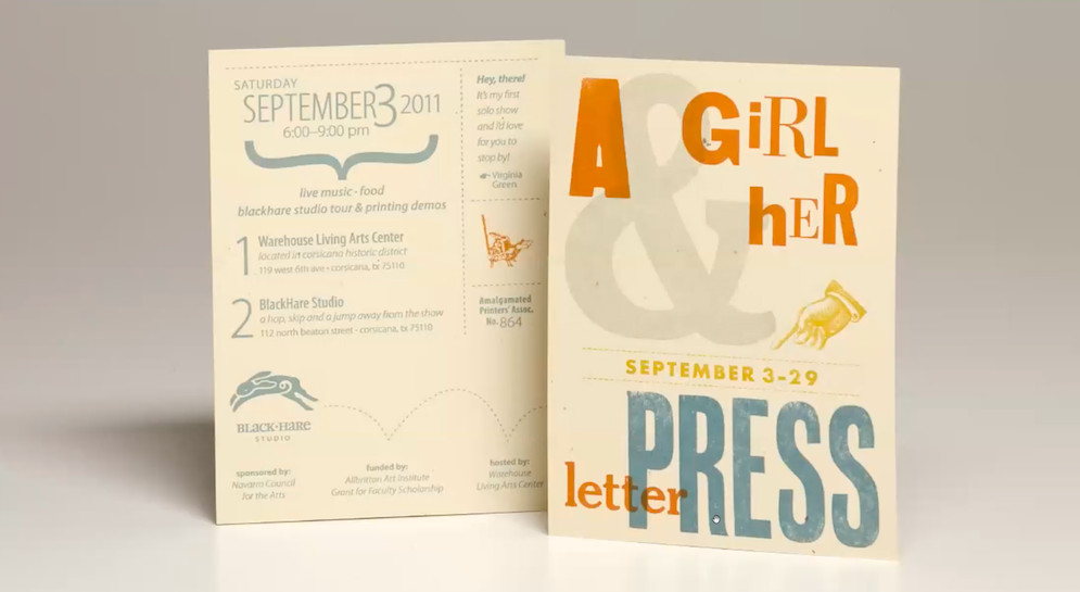
“So this was just my first solo so that I had, and this is a combination of polymer and would type in metal type,” said Green.
She was referring to an invitation to her first solo show with her newly opened studio in Sept. 2011. Designed with her letterpress, the cover featured a calm ecru background supported by a fun layering of various fonts in grey, orange, and a dusty blue and yellow. With a hand pointing to the dates it would be open, the title of the show was “A Girl & Her Letterpress.”
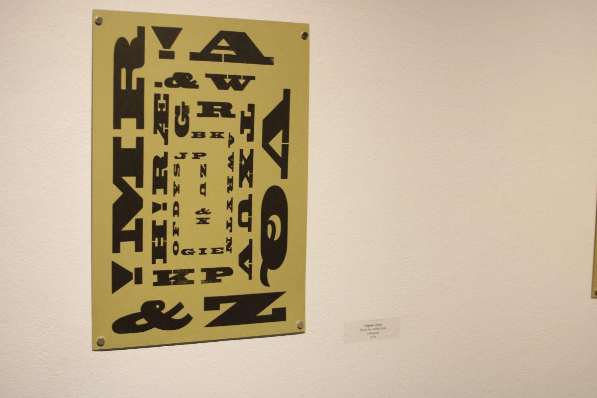
One of the pieces from Green featured in the exhibit at Todd Hall has a large ampersand with several terms that usually have “and,” in the middle of them, such as “track and field.”
Green described the material as “yummy, 100 percent cotton paper.”
Other series feature silhouetted birds accompanied by song lyrics.
“I always love silhouettes. I love dusk. You know, when the sun is going down and you just basically see a bold silhouette of things,” said Green.
“This was basically a series of birds and just connecting them to some song lyrics of songs that I was actually listening to in the studio at the time. A kind of inspirational series,” said Green.
Her work veered in yet another direction with a series of posters that featured animals, ranging from a large fluffy and green dog with print reading “Based on my wardrobe my favorite color is dog hair,” to a blue octopus wrapping its tentacles around text that read “Sometimes I wish I was an octopus so that I could smack eight people at once.”
The image was completed with a stamp design, like the ones you see for a New York Times Best-Seller, that read “Just call it like it is,” wrapping around the circle and surrounding the blue middle of the stamp that read “best policy.”
“I see that in my prints I don’t have this continuous body of work like some fine artists… I think of an idea and I just do a project,” said Green.
Another example of this was a horizontal piece featuring the notes for the standard tuning of a guitar backing up other symbols, from plants and her black hare logo to women posing in early twentieth-century clothing.
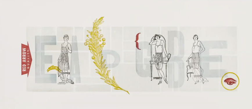
“So I was learning guitar right, so this is E A D G B E, which are the strings that you learn and I blended it with my love of botanicals and type and symbolism, you know the eye and then, of course, I put my little logo in there. Just kind of an interesting fun print, these are all polymers I think…I was being a little against the grain or something,” said Green.
Pakaste and Green came together with a shared love of typography and the letterpress to create this series that demonstrates the versatility of print in a digital world.
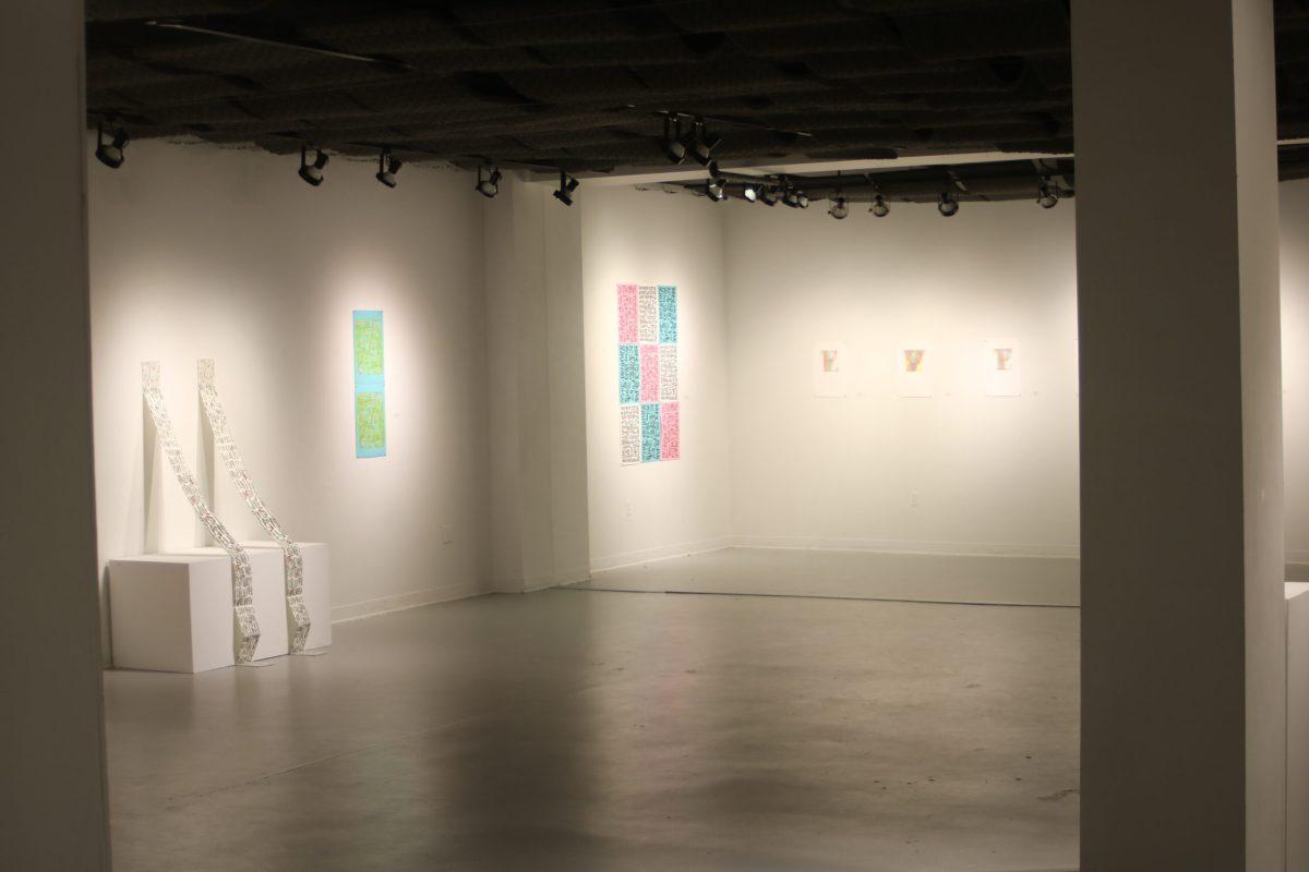
The “Typographic Visions,” exhibit will remain at MTSU’s Todd Art Gallery through Feb 16.
To contact Lifestyles Editor Ashley Barrientos, email [email protected].
For more updates, follow us at www.mtsusidelines.com, on Facebook at MTSU Sidelines and on Twitter at @Sidelines_Life.


